Versace Brand Codes: Medusa, Greek Key & Barocco
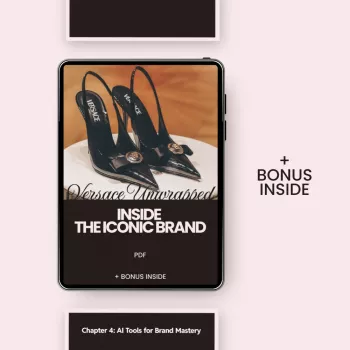
Versace Unwrapped: Inside the Iconic Brand
Versace’s identity is built on bold mythic symbolism, high-contrast glamour, and a confident Italian design language that blends classical references with modern provocation. The result is a look that reads instantly—whether it’s a runway gown, a belt buckle, or a framed border on a cuff. Below is a clear guide to Versace’s most recognizable visual codes, the signature motifs that carry meaning, and practical ways to spot (and style) that DNA across real pieces. For more guidance, see Versace Logo And Its Golden History: The Medusa’s Secret.
For brand context and current collections, see the Versace official website. For background on the house’s founder and cultural impact, Encyclopaedia Britannica’s Gianni Versace biography is a strong starting point. For further reading, see Versace.
What Makes Versace Instantly Recognizable
Versace is recognizable because it commits—fully—to an aesthetic that’s both historic and hyper-modern. Classical references (like Greek motifs) aren’t used quietly; they’re amplified and placed front-and-center, then paired with body-conscious cuts and high-voltage styling.
- A high-impact blend of classical mythology and contemporary sensuality
- Maximalist styling: saturated color, metallic accents, and statement silhouettes
- Graphic motifs used as visual shorthand across product categories
- A consistent tone of confidence, celebrity energy, and night-out glamour
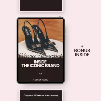
If you want a deeper, collectible-style breakdown of the brand’s design language, explore Versace Unwrapped: Inside the Iconic Brand – A Guide to the Versace Brand Identity Explained.
The Core Codes: Motifs, Symbols, and Their Meaning
Versace uses a handful of core elements repeatedly, almost like a visual alphabet. These codes work because they’re consistent: you can see the same motifs echo from jewelry to ready-to-wear to home pieces, creating immediate recognition.
- Medusa: a central emblem associated with allure, power, and unforgettable presence
- Greek key (Meander): a framing device that signals heritage, structure, and continuity
- Barocco prints: ornate flourishes and scrollwork that amplify opulence and drama
- Gold hardware and high-shine finishes: cues for luxury, boldness, and visibility
- Animal prints and high-contrast palettes: used to communicate confidence and edge
Versace identity elements and how they show up
| Identity element | What it communicates | Where it appears often |
|---|---|---|
| Medusa head | Magnetism, power, iconic status | Logos, jewelry, belts, bag hardware, packaging |
| Greek key border | Heritage, structure, signature framing | Trims, cuffs, waistbands, home collections |
| Barocco pattern | Ornate luxury, maximalism | Shirts, dresses, scarves, interiors, accessories |
| Gold + black contrast | Drama, nighttime glamour, high visibility | Runway looks, accessories, branding |
| Sculpted silhouettes | Confidence, body-conscious design | Eveningwear, tailoring, statement pieces |
Color, Typography, and Visual Energy
Versace doesn’t rely on a single color so much as a consistent intensity. The palette often works like stage lighting: contrast creates impact, and shine creates presence. Even when typography is used, it’s usually there to support the symbols rather than compete with them.
- Color language leans toward bold contrasts: black/gold, vivid jewel tones, and crisp white as a spotlight
- Print density is intentional: patterns often fill the canvas to create immediate recognition from a distance
- Typography typically supports the symbol rather than competing with it—clean, legible, and brand-forward
- Photography and campaigns prioritize drama: strong lighting, high contrast, and poised, assertive posing
From Atelier to Pop Culture: How the Identity Became a Global Signal
Versace became a cultural signal because its codes are built for visibility. The motifs are bold enough to read quickly, the silhouettes photograph well, and the styling naturally belongs in moments where attention is the point.
- Runway moments and red-carpet styling amplify brand codes through high-visibility cultural events
- Celebrity associations reinforce the message of glamour, confidence, and spectacle
- Versace’s identity remains consistent even as trends change: motifs stay stable while styling evolves
- Collaborations and modern collections often remix the same codes—Medusa, Meander, Barocco—into new forms
How to Spot Versace Design DNA in Real Pieces
Authentic Versace “reads” like Versace because it organizes the eye: a focal emblem, a structured frame, and a finish that catches light. When several of these cues appear together, the brand identity becomes unmistakable.
- Check for a strong focal emblem (often Medusa) placed where the eye naturally lands: clasp, buckle, chest, or center-front
- Look for borders and frames: Greek key patterns frequently outline edges like cuffs, hems, and waistlines
- Observe the material choices: glossy leathers, polished metals, and saturated prints support a high-drama look
- Note proportion and fit: many silhouettes are designed to look powerful in motion and under bright light
- Evaluate styling intent: pieces often read as statement-first, with simpler supporting items around them
Building a Versace-Inspired Wardrobe Without Overdoing It
The easiest way to capture Versace energy without tipping into “costume” is to treat the brand codes like a spotlight: one strong element gets center stage, and everything else supports it. That approach keeps the look sharp, modern, and intentional.
For a maximalist counterpoint that still pairs well with clean, modern basics, consider statement tailoring like Etro High-Waisted Silk Floral Pants—then keep the rest of the outfit controlled so the print does the talking.
FAQ
What does the Medusa symbolize in Versace?
Medusa functions as Versace’s signature emblem of allure and power—something magnetic that’s hard to forget. It’s repeated across categories (from hardware to logos) so the brand reads instantly at a glance.
What is the Greek key pattern on Versace designs?
The Greek key (also called the Meander) is a classical motif used as a border or frame. Versace uses it to communicate heritage and structure while creating a crisp, recognizable outline on trims and edges.
How can a piece be styled to feel Versace without looking costume-like?
Use one statement code at a time (like gold hardware or a bold border) and keep the supporting items minimal and well-fitted. A controlled palette—often black with gold accents—helps the look feel polished rather than overloaded.











Leave a comment